P R O L O G U E-
"If the nautical chart and the reality are incom-
.patible, the sailor should believe the reality."
It is generally considered to be self-evident that the disciplines which are based on natural sciences must also be based on empirical knowledge. It is likewise considered self-evident that teaching material which is based only on suppositions and unsubstantiated claims must be omitted from the curriculum.
But why is this not always the case in the teaching of colour theory?
The suppositions based on belief which have been accepted as key contents of colour theory are in total conflict with the observable reality.
This lack of critique can be found in elementary schools and secondary schools as well as in institutes of higher education. In addition, when colour theory is also taught in the context of different kinds of vocational studies and all-round educational studies, can the effects of circular reasonings derived from fallacies be seen as unwanted phenomena in many walks of life.
When this belief-based teaching is offered even in postgraduate programmes, the accuracy of the given information will very likely go wholly uncontested.
For the sake of their own credibility, at least universities should adjust the theoretical basis of their colour theory teaching to fit the scientific community's strict requirements of openness and self-correction.
According to the opponent colour theory by the physiologist Ewald Hering (1905), that seeks to explain colour vision, and the other theories later developed from it, colour perception begins as a 'tri-colour reaction' by the retina's cone cells. In the next stage the visual system processes the tri-colour information sent by the eyes as mutually exclusive opponent colour pairs thus:
--
blue (B) against yellow (Y),
--
- red (R) against green (G), and
--
- black against white.
Therefore, accordings to this theory, we cannot see bluish-yellow or reddish-green colours for the same reason that we cannot say that something is both dark and light at the same time.
_ Achilles' heel exposed
Those individuals who observe their colour perceptions critically can very easily notice that the aforementioned theory can't correctly explain the colour phenomena we perceive.
The credibility of the theory in question is completely brought down by the claim, that red and green are mutually exclusive opponent colours. This is actually the most apparent weakness of the opponent colour theory, its achilles' heel.
Although some researchers consider red-green colour blindness and especially coloured afterimages as sufficient proof, that red and green are indeed opponent colours, show inverted colour phenomena nevertheless something very different.
On this site can everyone see for themselves, why red and green just cannot be opposites and which colours really are. (For example, see afterimages here.)
- Reddish green is a real colour after all
The theoretical school of thought founded on the opponent colour theory (which has risen to a hegemonic status) has tried to deny us the very existence of reddish green colours, the same ones that we can see every autumn in the leaves of the trees. But, according to these theorists, we cannot see them or even imagine them.

But as shown in the images above, it is quite obvious that reddish green colours are just as real as are bluish greens (= cyan) or bluish reds (= magenta, purple). Especially noteworthy in the above images is that the adjacent leaves are identical in colour.
The basic research in the field of neuropsychology has produced a significant amount of new knowledge about how our visual system fuctions. This is, naturally, essential for medical science, but it's quite necessary also on other fields, for example, when we're developing an eyesight for robots and computer-controlled devices which imitates human colour vision. However, this is only possible if, sometime in the future, we succeed in perfectly modelling the human colour vision. For this we need a lot of further basic research.
Mere faith in the opponent colour theory will not, however, help in reaching this kind of goals. Also, the critical researcher should learn to pose the questions concerning colour vision straight to people, not, say, rhesus monkeys.
Contrary to the common assertion, me can indeed perceive reddish green colours. We just call them yellow, greenish yellow, reddish yellow depending on which of our visual system's colour channels is more activated, the red one or the green one. When these reddish greens have a dark hue, they are called olive green, dirty green, brown and so on.
This means that yellow is always produced in cooperation of two colour channels, just like are cyan and magenta:
___
-
Cyan (C) = bluish green (B + G = C)
_
Colour channels in the visual system
The retina has four types of cells, which are sensitive to light's energy. First are the rod cells which are specialised in scotopic (low light) vision, the other three are cone cells. They are situated in the so-called fovea which deals with sharp vision. They are as follows:
- M-type cells (M = medium) react to medium wavelength light, i.e. green ( G
). This cell type is most sensitive to the wavelength of approximately 530 nm. About 1/3 of the retina's cone cells consists of this type.
< S-type cells (S = short) react to short wavelength light, i.e. blue ( B
). This cell type is most sensitive to the wavelength of approximately 460 nm. Only about 5-7 % of the retina's cone cells consists of this type.
_
How the anatomically complex and neurologically multiphased visual system functions can be compared to the way colour images are created on television screens and computer displays with three colour channels, a red, a green and a blue channel. In fact the principle behind the image formation of a colour television is founded on the Young-Helmholz theory of human colour vision. Both, the television's image formation and the human colour vision, can thus be called additive (light increasing) systems.
Consequently, 'colour channel' is a perfectly applicaple term for explaining the principles of human colour vision:
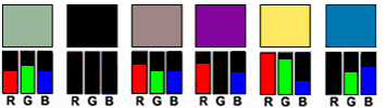
When trying to demonstrate colours and the perception of colour phenomena, the colour columns of the RGB-diagrams can be used to show:
_-
A
) the acticity levels of the RGB colour channels
_-----in a visual event, or
Some graphics softwares use similar 'colour elevators' for colour modification (i.e. changing the values of RGB lights).
As mentioned above, the RGB colours are the three main colours of our visual systems' colour channels. Because of this they are also the only primary colours: all the colours we see around us result from the activity of the three colour channels. Whether they are mixtures of yellow and blue paint, four-colour pictures in a newspaper, colours on a TV screen, or colours flickering on a soap bubble, they are generated by our brain which interprets the ratios and values of the RGB lights.
One should keep in mind what Edwin H. Land , the american scientist and inventor of the Polaroid camera, said about colour vision:
This way of operating is, according to Land, the basic feature of our visual system by which the brain can keep colours constant (i.e. recognizable) despite changes in lighting conditions.
-
Opponent colour:
-
A CONSEPT WITH MULTIPLE PROBLEMS
In addition to the fact that the 'backbones' of colour theory teaching, the theories of Johannes Itten and Johann Wolfgang von Goethe and many of the opponent colour theory's claims, cannot be empirically verified, are also the consepts of 'opponent colour' and 'complementary colour' vague and ambiguous.
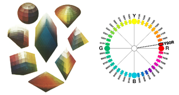
When one uses the expression 'opponent colour' (i.e. the colour which is opposite another in a circular or otherwise formed colour sequence or system), one should settle right away, which system is being used. Is the opponent colour in question perhaps in Otto Runge's, Isaac Newton's, Goethe's, Michel Eugène Chevreul's, Itten's, Wilhelm Ostwald's, Albert Munsell's or Heinrich Frieling's system, or maybe some other? Many colour systems with their own opponent colours have been created for different kinds of purposes from different kinds of perspectives (see picture below).
Of these systems has especially Johannes Itten's system become, unfortunately, the one truth carved in stone.
All of the colour theory teaching, which builds on Itten's fallacies, is full of fiction and circular reasoning about colours, colour phenomena and so called laws of colour harmony.
Although this theorized nonsense has been taught obediently for decades around the world, the 'theory' has not been refined into something that can endure open critique; no one has yet managed to produce, in accordance with Itten's theory, 'neutral grey' with opponent colours and submit the result for public review.
Not even nature can produce neutral grey with colours specified by Itten! How on earth could we then manage to do that just by mixing some paints and pigments?
_______-
Nonetheless tens of student generations have spent their scarce and precious colour theory lessons doing Itten's complemetary colour exercises and they will very likely continue to do so unless this situation is decisively intervened in.
__
Colour theory onto the road to renewal
Universities and other institutes of higher education, and especially the authorities that supervise the quality of education, should take responsibility for renewing colour theory studies.
In addition, the educators supplying colour information should themselves awake to recognize and acknowledge the unsubstantiated elements in their teachings.
Of course, resistance to change is understandable and, indeed, quite human, but to trust misconseptions and belief-based suppositions is also self-deception.
On a personal level can self-initiated studying of valid information open up the fastest route to empirically solid colour theory, but the seriously needed comprehensive mending of colour theory teaching requires revisions on a fundamental level, in other words:
1) goals,
2) contents, and
3) methods.
_-
Inverted colour: a more useful consept
Since the terms 'opponent colour' and 'complementary colour' carry the burden of obscurity, their usage undermines the credibility of the user as well as the subject matter itself. 'Inverted colour', on the other hand, is in many ways a much better consept, because it doesn't have the qualities of unreliability and inaccuracy.
Inverted colours are part of our visual system.
--
When you see it yourself, you no longer
.--The colour is always what it looks like.
_Let's ask the people


___
-
Magenta (M) = bluish red (B + R = M)
___
-
Yellow (Y) = reddish green (R + G = Y)
L-type cells (L = long) react to long wavelength light, i.e. red ( R
). This cell type is most sensitive to the wavelength of approximately 650 nanometres (nm). About 2/3 of the retina's cone cells consists of this type.
The amount of cone cells is sometimes indicated as the following ratio:
10/5/1.
_-
B) RGB ratio in a single colour
_--- The only primary colours
_------ Theorized nonsense

.--have to believe unfounded claims.

Martti Huttunen, BoD, 2018
